Emery Professional Development Center
Welcome to the Emery Professional Development Center, where we specialize in crafting impactful branding and visual identities that elevate your organization's presence and convey professionalism and credibility.
Project Type -
Branding and Visual Identity
My Role -
Art Director and Brand Designer
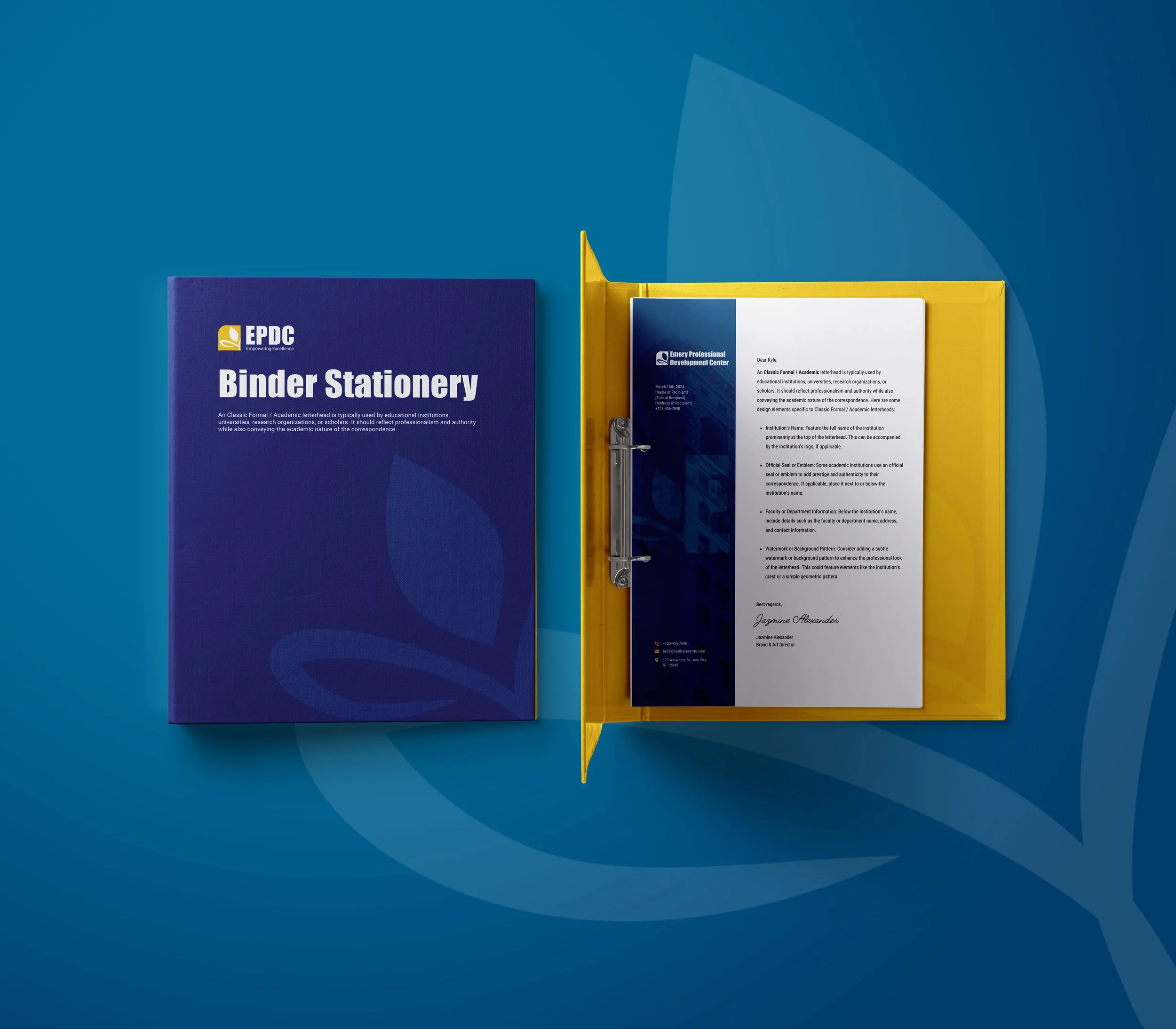
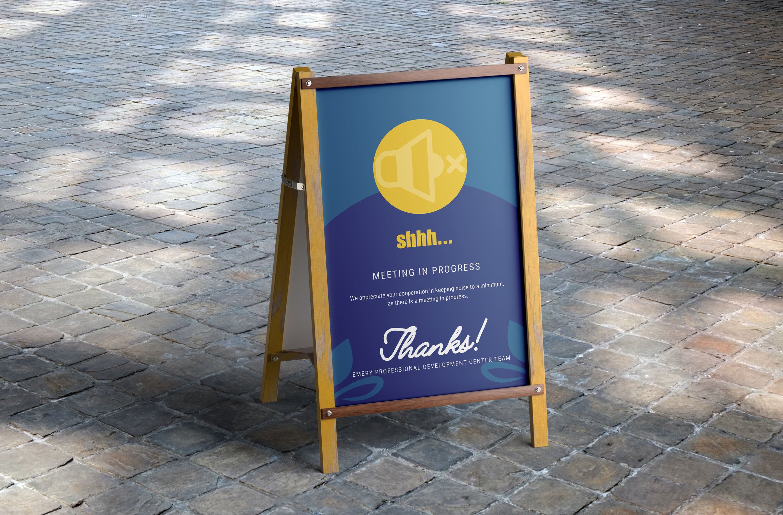
The development of Emery Professional Development Center (EPDC) involved collaboration with esteemed colleagues like Dana and Kyle from the DCPS team. EPDC was envisioned with a corporate style that infused the brand's ethos and purpose into every aspect of its visual representation, from logos to comprehensive branding strategies.
Basic Branding and Logo Design
Knowledge Kin Style
For this design inspiration, we drew from the definition of the word "Emery," which conveys qualities of industriousness, power, and leadership. Reflecting on this definition, the Professional Development Center serves as the primary hub for professional growth within DCPS. It offers vital resources and support to empower the teams stationed within, aligning with the name's connotations of strength and leadership.
Typography Psychology
The "Bold/Loud" font group combines the impactful presence of Impact, the modern strength of Futura Bold, and the condensed readability of Roboto Condensed to create a bold and commanding typographic palette suitable for designs that require bold emphasis and visual prominence.
-
Geoffrey Lee designed Impact font for the Stephenson Blake foundry in 1965. The sans serif display typeface is very heavy and condensed in the grotesque style, similar to Helvetica Inserat. Use Impact font in display situations requiring a strong statement.
-
Sans serif fonts have a consistent thickness and no feet like their serif counterpart. They are the most simplified of the fonts and feel modern and clean. These fonts are often used for large bodies of text online. You’ll notice that most apps and websites use a san serif font for readability. Brands who want to demonstrate a straightforward, simple, and no-nonsense attitude gravitate towards using a sans serif with their brand fonts.
-
Clean, modern, engaging, chic, honest, clarity, geometric, humanist, and universal
Symbol and Meaning
Parts of the Emery Logo
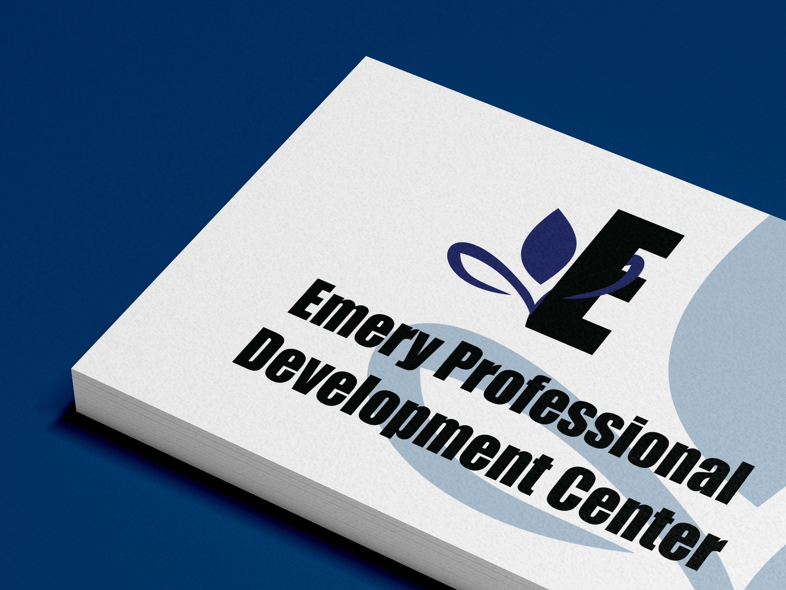
My primary focus was to encapsulate the true essence of the word "Emery." What resonated with me most was the notion that our visual concept should exude strength, leadership, and professional advancement. With this in mind, I envisioned translating this message into a visually represented symbol of growth, akin to that of a plant.
Plants are universally recognized symbols of resilience, strength, and community betterment. Therefore, I propose incorporating a plant or leaf icon wrapped around the letter "E." This design not only embodies the worth, collaboration, and strength of Emery Professional Development Center but also signifies growth and advancement. By intertwining the plant imagery with the initial "E," we communicate a powerful message of progress and prosperity, reflecting the core values and aspirations of the organization.


