Punk Nation Restaurant
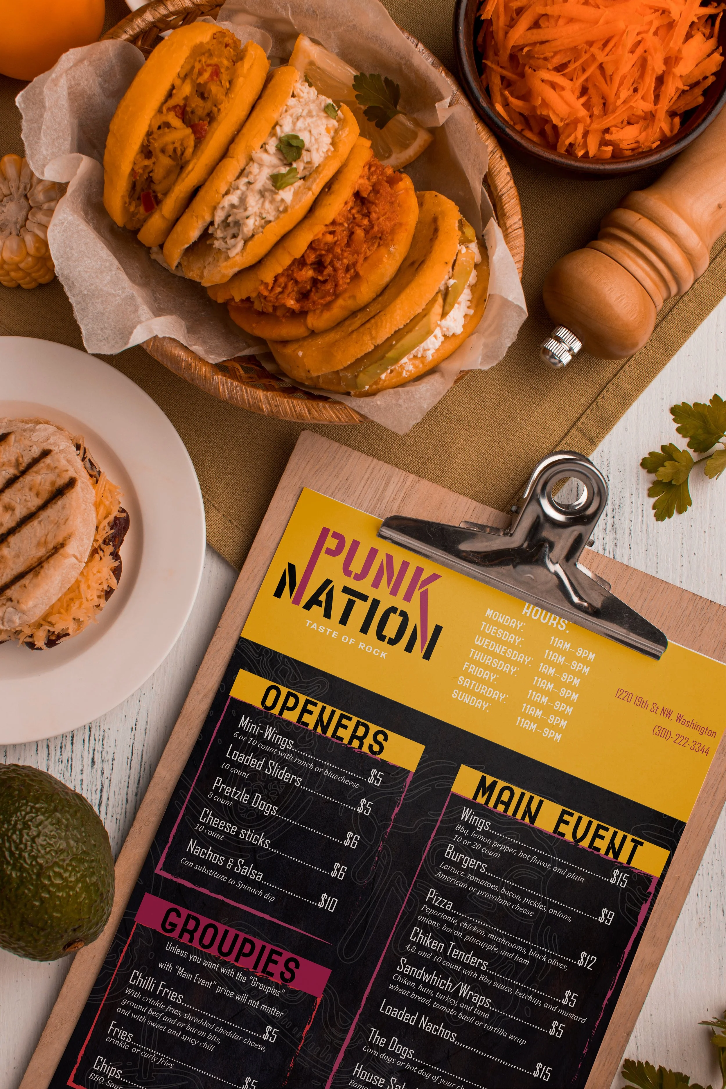
Welcome to Punk Nation Restaurant, where we fuse rebellious spirit with culinary excellence to create a dining experience like no other. Our collaboration with Punk Nation exemplifies our commitment to immersive restaurant concepts and bold branding
Project Type -
Restaurant Concept and Branding
My Role -
Art Director and Brand Designer
As the Art Director and Brand Designer of Punk Nation Restaurant, the objective is to create an environment that embodies the rebellious spirit of punk culture while providing exceptional eating experiences. Punk Nation captures the colorful energy of 1970s music and culture, inviting fans of both rock and food to celebrate together. Punk Nation, founded on inclusivity, is a place where people of all races, genders, and sexual orientations may meet and interact. Drawing inspiration from the grassroots promotional tactics of rock bands from the era, such as distributing posters, flyers, and stickers, we infuse the restaurant's branding with an authentic homage to its rebellious roots.
Branding
The branding strategy is rooted in the rebellious spirit of punk culture, with a distinctive logo and visual identity that sets Punk Nation apart from traditional restaurants.
Post-punk, emerging in the wake of punk's revolutionary ethos, continued the tradition of challenging musical conventions while embracing experimentation. While punk boldly tore up the rulebook of music, advocating for raw ideas over technical prowess, post-punk bands sought to expand upon this ethos by rejecting the confines of the three-chord thrash formula that had come to define punk.
Instead, they embraced a wider spectrum of musical ideas and influences, resulting in a diverse array of sounds and styles. Post-punk serves as a catch-all term encompassing a multitude of bands that drew inspiration from various sources, weaving together disparate elements to create music that defied categorization and pushed the boundaries of sonic exploration.
Font Psychology & History
Jesse Ragan stumbled upon a set of unconventional letters on a cardboard box in New York City. Inspired by their unpretentious charm, he created an all-caps typeface called Export, in Regular and Stencil versions, preserving the raw essence of the original. Export's design incorporates bulges and pinches for a unique internal logic, with rough edges adding a tactile quality. While individual characters command attention, the typeface maintains an industrial rhythm suitable for longer texts. Export Stencil adds a twist to the playful concept, featuring breaks that are both practical and unexpected, while still ensuring durability reminiscent of shipping caution symbols.
Description
Sans-serif fonts, distinct for their consistent thickness and absence of decorative feet, embody a streamlined and contemporary aesthetic. Renowned for their simplicity and cleanliness, they stand as the most simplified of font styles, often favored for their modern appeal. Particularly prevalent in digital mediums, sans-serif fonts are preferred for their exceptional readability, making them a staple choice for large bodies of text online. Across various platforms, from apps to websites, their ubiquity underscores their versatility and effectiveness in conveying information. Brands seeking to convey a straightforward, no-nonsense attitude frequently opt for sans-serif fonts in their branding, aligning with their ethos of simplicity and clarity.


