The À Venir Way
Welcome to The À Venir Way, where we specialize in brand development and visual content creation aimed at capturing the essence of your brand and connecting with your audience on a deeper level.
Project Type -
Brand Development and Visual Content Creation
My Role -
Creative Director, Graphic Designer, and Illustrator Designer
Credits-
Clothing Designer: Demetrius Alexander
Photographer: Vanessa Alexander
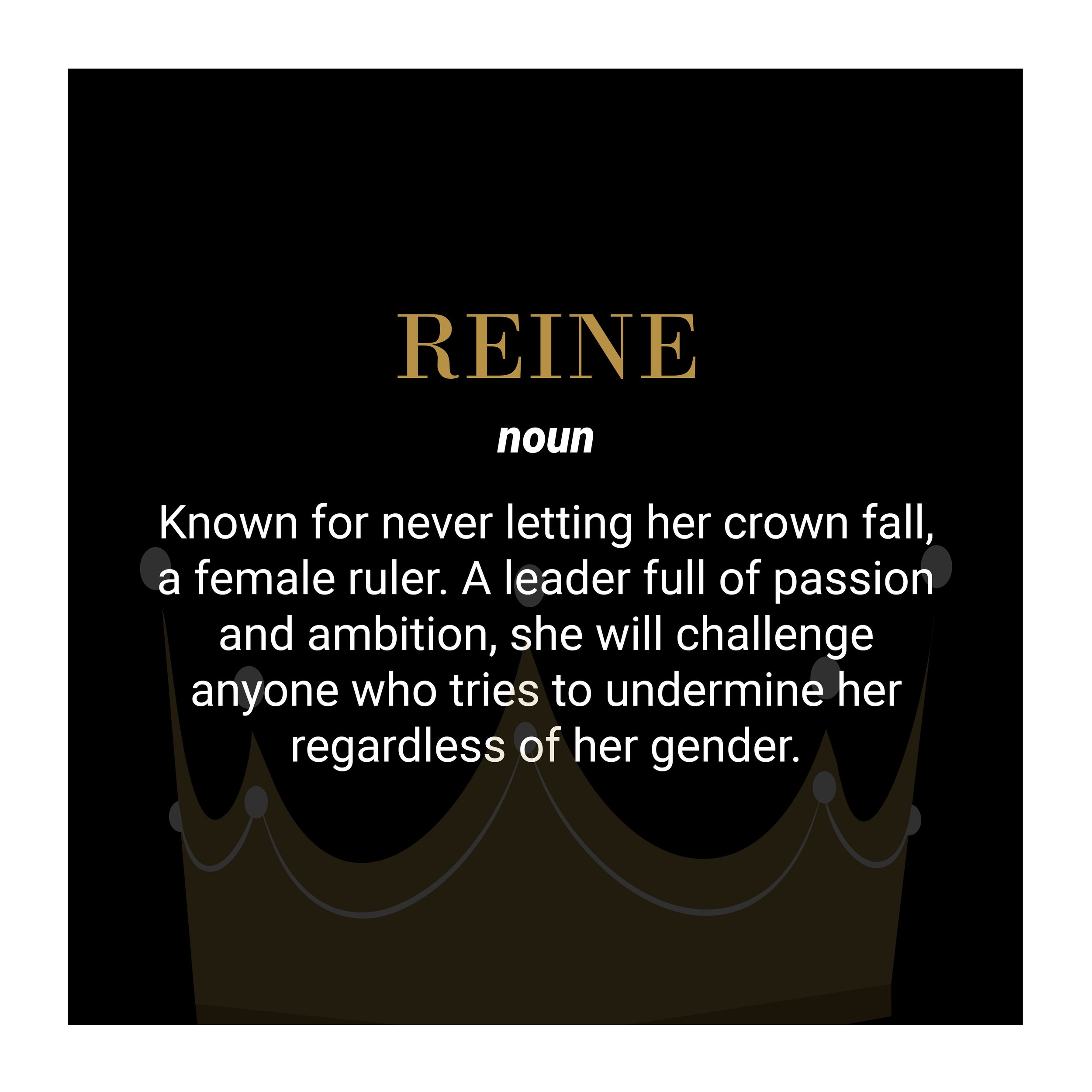
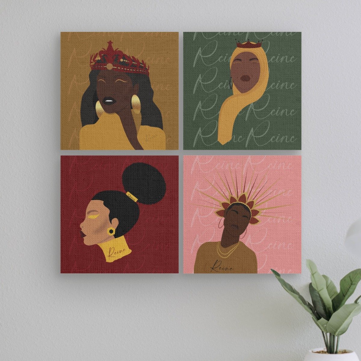
At The À Venir Way, Demetrius aims to empower women through innovative designs and diverse, thoughtfully crafted products. Our Definition shirts reclaim stigmatized words through elegant French, turning them into affirmations like ‘Reine’ (Queen) and ‘bourgeoisie.’ As the Creative Director & Designer, I brought this vision to life, ensuring every piece uplifts and inspires.
Brand Identity Development with Brand Strategy
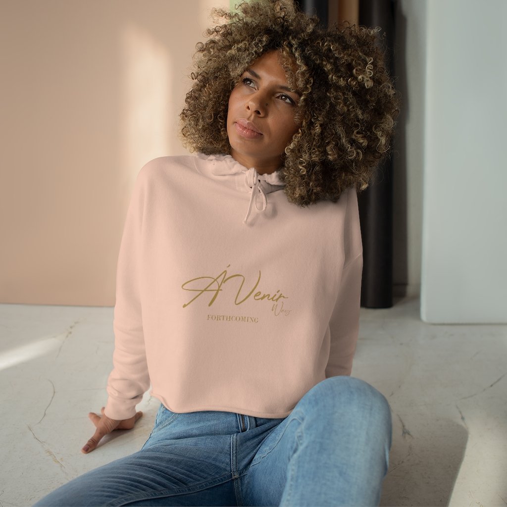
The term "À Venir" holds profound significance within our brand ethos. French for "forthcoming," it embodies the essence of anticipation and purpose, serving as a cornerstone of our branding philosophy. Our clothing designs intricately weave together English and French typography, reflecting the diverse cultural influences that shape our brand narrative.
At the core of our brand's meaning, "forthcoming" extends beyond its literal translation. It encapsulates the journey of seeking purpose and moving forward with intention in life. Our apparel serves as a visual manifestation of this ethos, inspiring individuals to embrace their path with confidence and determination.
Designed to complement diverse personalities regardless of age or skin color. We challenge traditional professional attire by introducing color while maintaining a polished look.
We prioritize meeting individual needs, considering factors like body shape and comfort preferences. Unlike typical retailers, we value customer feedback and prioritize quality over quantity. Our goal is to provide clothing that feels like a second skin, fostering comfort and confidence in every wearer.
Website Design
Website designs are not just visually stunning but also intuitive and user-friendly, ensuring a seamless online experience for my client audience.











Font Psychology in the Fashion World
Script fonts are generally much fancier than their serif counterparts and often resemble handwriting or cursive. They are classified as letters that are connected and flow together in a fluid motion. Script fonts can be hard to read and should be used with care. Don’t use script fonts for body copy or long sentences. Do use script fonts for short call-outs or as an accent font used sparingly within your brand fonts system.
Handwritten fonts emulate the organic charm of handwritten inscriptions created with diverse writing tools like pencils, pens, or brushes. They are a popular choice for greeting cards, invitations, and embellishing inscriptions for special occasions. With their authentic and personal feel, handwritten fonts add warmth and character to any design, making them a versatile and beloved option for a wide range of festive events and creative projects.
Bodoni MT stands as a quintessential rendition of the modern style serif, originally crafted by Monotype. Characterized by its elegant and refined appearance, this timeless typeface has endured through the centuries, retaining its allure and sophistication. Developed with meticulous attention to detail, Bodoni MT embodies the essence of neoclassical design, with its precise lines, pronounced contrasts, and graceful curves. As a cornerstone of typographic history, it continues to captivate designers and readers alike, serving as a testament to the enduring legacy of Giambattista Bodoni's masterful craftsmanship.
Why Script font?
Using a script font for a fashion clothing brand targeting women and embracing feminine branding is an excellent choice for several reasons:
-
Script fonts exude elegance and sophistication, qualities that align well with the aspirational image often associated with fashion brands. They convey a sense of luxury and refinement, elevating the perception of the brand among its target audience.
-
Script fonts typically feature flowing, cursive letterforms that evoke femininity and grace. This aesthetic resonates with women who are drawn to fashion and beauty, making it an ideal choice for brands seeking to appeal to a female audience.
-
Script fonts can create a sense of intimacy and personal connection with the audience. Their handwritten appearance suggests a human touch, fostering a bond between the brand and its customers by conveying warmth and authenticity.
-
Typography plays a crucial role in shaping a brand's identity and personality. By choosing a script font, a fashion clothing brand can establish itself as feminine, sophisticated, and stylish, effectively communicating its values and positioning in the market.
-
Script fonts offer versatility, allowing for creative expression across various brand touchpoints, including logos, packaging, advertising materials, and social media content. Whether used for headlines, taglines, or body text, they can adapt to different design contexts while maintaining consistency and coherence in the brand's visual identity.
Color Psychology in the Fashion World
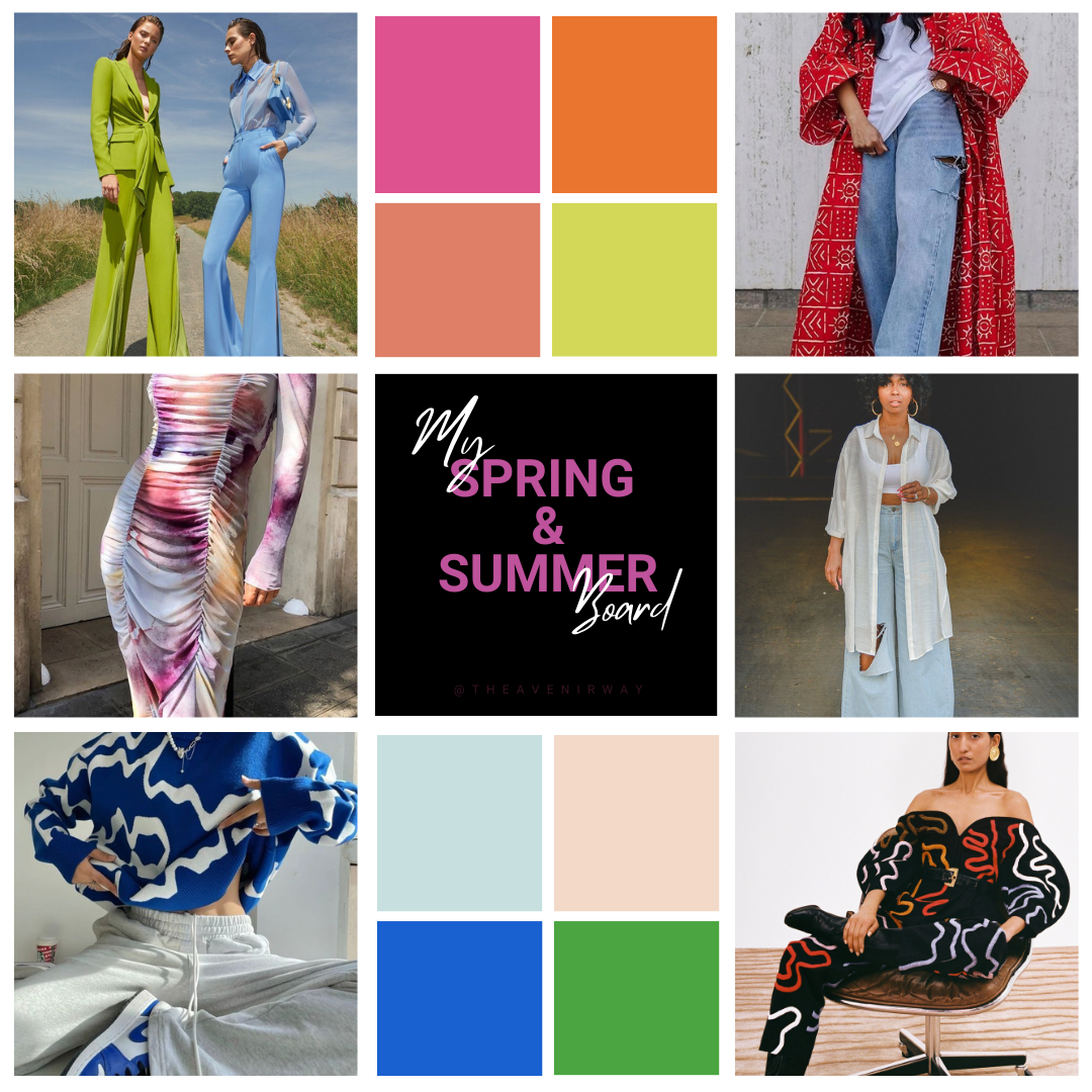
In fashion design, color theory is paramount. As a brand designer, I leverage color psychology to create visually compelling collections that resonate with audiences. By carefully selecting colors aligned with brand identity and target demographics, I craft designs that evoke specific emotions and perceptions. Whether it's integrating seasonal trends or experimenting with color blocking, I prioritize color theory to ensure each project embodies the brand's essence and fosters a meaningful connection with customers.
Satin Sheen Gold
-
Gold has a rich history spanning centuries, symbolizing wealth, royalty, and prestige across diverse cultures. The introduction of Satin Sheen Gold, with its contemporary fusion of hues and satin finish, revitalizes this traditional color, infusing it with a modern allure.
In line with color theory, gold evokes notions of success, opulence, and affluence. The addition of a satin sheen elevates its aesthetic, imbuing it with an extra layer of sophistication and refinement. Consequently, this luxurious hue finds widespread application in interior design, fashion, and artistic expression, where it serves as a symbol of elegance and prosperity.
Throughout history, gold has held significance in various societies, representing power, divinity, and beauty. Satin Sheen Gold builds upon these associations, enhancing its symbolism with its distinctive sheen. As a result, it remains a versatile and enduring choice, capable of evoking timeless allure and resonating with contemporary sensibilities.
-
At The À Venir Way, we understand the power of symbolism in design, which is why we've chosen Satin Sheen Gold as a cornerstone of our aesthetic. Reflecting centuries of tradition, this luxurious hue embodies the values of wealth, royalty, and prestige, aligning perfectly with our brand's commitment to sophistication and elegance.
Claret
-
The rich history of Claret color traces back to its origins in the French word "clairet," denoting a light rosé-style wine from the renowned Bordeaux region. Evolving over time, the term came to represent the deeper, red wines that Bordeaux became renowned for producing.
Claret has long been intertwined with notions of luxury and refinement, historically reserved for momentous occasions and esteemed events. Its deep red hue serves as a symbol of power, passion, and resilience, making it a favored choice among royalty and aristocracy across centuries. As a timeless emblem of sophistication and strength, Claret continues to captivate and inspire, transcending trends and retaining its esteemed status in the world of color.
-
At The À Venir Way, we appreciate the significance of color in conveying messages and making statements. That's why we've embraced Claret as a staple hue in our collections. With its rich history and deep symbolic meaning, Claret resonates with our brand's commitment to timeless elegance and sophistication.
Claret's enduring appeal transcends trends and fashions, making it a versatile choice for those seeking to make a bold statement with their wardrobe. Its timeless allure perfectly aligns with our brand's ethos of empowerment and self-expression.
From classic garments to statement accessories, Claret embodies the essence of The À Venir Way, offering our customers a timeless and versatile option that allows them to express their individuality with confidence and style.
Raw Umber
-
Raw Umber boasts a rich history as a pigment dating back thousands of years, tracing its origins to ancient civilizations. Derived from natural sources like clay deposits, this pigment found widespread use in paintings and artistic endeavors throughout history.
Renowned artists such as Rembrandt and Leonardo da Vinci recognized the unique qualities of Raw Umber and incorporated it into their masterpieces. Its earthy tones and versatile properties allowed for the creation of nuanced shades and textures, adding depth and realism to their artworks.
From ancient times to the present day, Raw Umber continues to be valued by artists for its timeless appeal and rich, organic hues. Its enduring presence in the world of art serves as a testament to its versatility and lasting impact on creative expression.
-
The color Raw Umber embodies qualities of stability, strength, and simplicity, resonating deeply with themes of nature, earth, and grounding. Its subdued and natural appearance lends itself well to a myriad of artistic and design applications, evoking a sense of authenticity and timelessness.
At The À Venir Way, Raw Umber holds special significance for us. It symbolizes the inner strength and resilience of the strong, powerful women who make up our audience—the modern-day queens who navigate life's challenges with grace and determination. Just as Raw Umber represents grounding and stability in nature, it serves as a tribute to the unwavering resolve and steadfastness of these remarkable individuals.
Through our brand's embrace of Raw Umber, we honor the diverse experiences and journeys of women everywhere, celebrating their inherent power and fortitude. It's more than just a color—it's a symbol of empowerment, solidarity, and the beauty found in simplicity.
Social Media Graphics, Content Creation, and Marketing Strategy
Eye-catching Instagram stories or engaging Facebook posts, specialize in creating visually appealing content that not only drives interaction but also reinforces your brand identity. From informative blog posts to captivating video series, we excel at crafting compelling content that resonates with your audience and effectively communicates your brand's story.
